

As the Visual Designer of this project, I collaborated with the UX Designer to create a MVP for our client ParentApp, a team looking to create an app to help caregivers conduct home exercise programs for children with complex cognitive and physical disabilities.
Timeline:
10 weeks
Tools:
Figma
Miro
Notion
Roles:
UI Design
Visual Design
User Interviews
P R O B L E MThere are no tools for caregivers of children with complex disabilities to store or track information about their patients’ home exercise programs.
Caregivers of children with complex disabilities are met with decision fatigue and mental blocks when it comes to conducting home exercise programs for their patients.
Home exercise programs are what allow children to make the most progress in their mobility and cognitive function yet the tools do not exist for caregivers to aid in making and tracking meaningful progress.
S O L U T I O NA centralized app that holds all the information regarding patients’ home exercise programs will help caregivers make easier decisions that are adaptable to each unique environment.
To minimize decision fatigue, the app includes an activity finder feature where caregivers take a very short survey to get matched with an activity based on their answers.
To minimize cognitive load, each exercise comes with clear, step-by-step instructions and pictures as visual aid.
To track progress, the app deploys an optional Feedback survey after each activity is finished. This allows caregivers to see if the exercise is getting easier for the child over time.
As the sole Visual Designer, I was responsible for the look and feel of these solutions. Creating mood boards, hi-fidelity wireframes, a design system, and a complete style guide were my priorities.
I N I T I A L R E S E A R C H & E X P L O R A T I O N SParentApp came to us with an idea of what they wanted to build. They had no MVP or brand so it was up to me to determine the visual design of ParentApp.
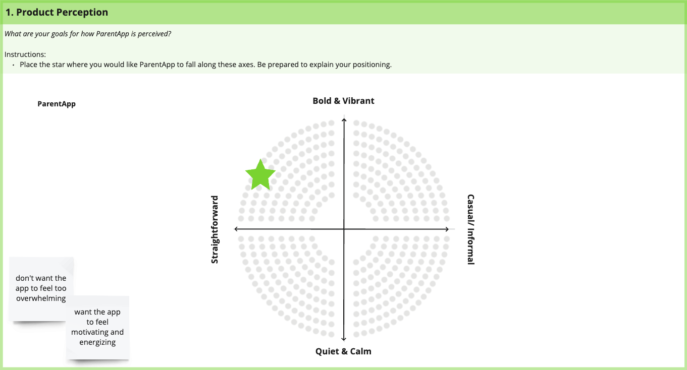
During our kick off call with the team, we had the ParentApp team participate in an UI exercise to determine what aesthetics and adjectives they gravitated towards. This helped me understand what they want to see in their app. Through this exercise, I was able to determine that most of the team leaned towards:
Bold and vibrant aesthetic
Clear iconography
Color coding
Liberal use of graphics and illustrations
Some of the team members valued a clinical and straightforward feel since they wanted the caregiver to be able to access the information they need fast without any fluff. I took this into consideration when working on the moodboards.
M O O D B O A R D SWith the information gathered from the client kick-off call I was able to determine two directions of moodboards I would create:
Fun, Bold, and Motivating
Practical, Positive, and Supportive
For the moodboards, I created elements I knew had a higher likelihood of being used in the app such as cards, input forms, navigation bar, and so on. This was done in order to give the team a better understanding of how the app may look.
Moodboard for fun, bold, and motivating directionFor the Fun, Bold, and Vibrant direction, I used:
A saturated color palette with multiple accent colors to make it more motivating and eye-catching.
Serif fonts for a welcoming and friendly look
Rounded elements for a playful feel
Screen with confetti for loud and vibrant celebrations
Moodboard for practical, positive, and supportive directionFor the Practical, Positive, and Supportive direction, I used:
A limited and muted color palette for a calm atmosphere
Gradients to show warmth and visual interest
Serif fonts along with sans-serif for both contrast and a trustworthy feel
Sharper elements to remain approachable yet professional
When presenting my moodboards to the team, the team favored the Fun, Bold, and Motivating direction. Other feedback included:
More illustrations depicting youth and different bodies
Pilled buttons weren’t favored, the team wanted something in between the rectangular and pill button
The feedback was taken into consideration as I worked on Moodboard revisions.
S T Y L E G U I D E SNow that the direction of ParentApp in terms of look and feel were determined, I was able to start creating a Style Guide. Creating a Style Guide before jumping into High Fidelity screens allowed me to design with consistency.
H I - F I D E L I T Y S C R E E N S & U I C O N S I D E R A T I O N SWhile designing these high-fidelity screens, I had a list of UI considerations that I always referred to to make sure that I was designing with the user in mind. Items from the list include:
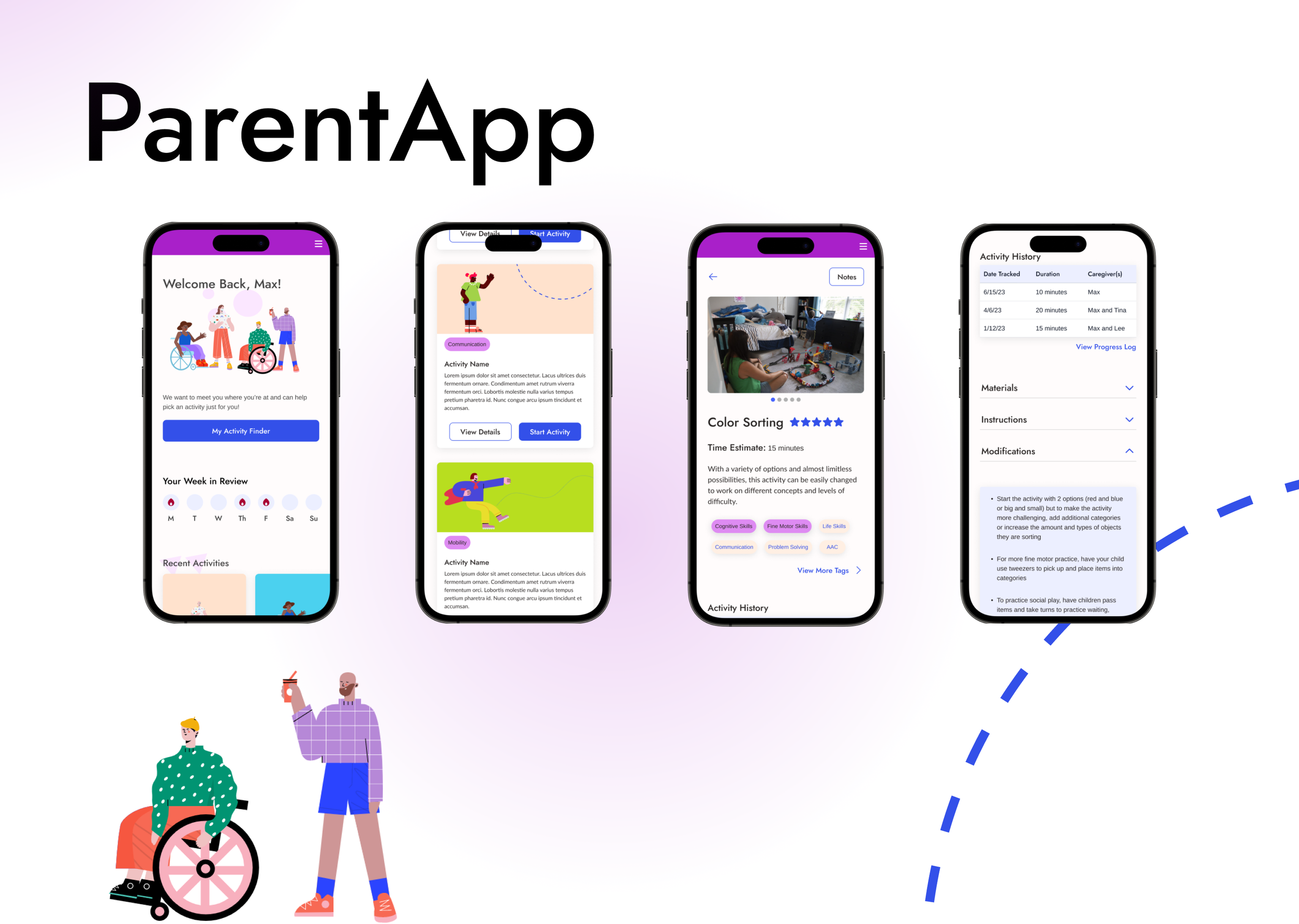
Spacious touch targets - an app dedicated to home exercise activities should have ample touch targets to account for physical movement while using the app.
Maintaining ratio of 4.5:1 to meet WCAG accessibility standards
Free-flowing elements but showing clear separation through spacing and decorative motifs
Youthful illustrations
Rounded buttons
Vibrant and motivating color palette
Examples of ParentApps’ hi-fidelity screens. View full prototype here.
R E F L E C T I O N SWorking on this project opened my eyes in so many ways! From presenting my designs, articulating design decisions, and taking into account client feedback all while learning the technicalities of Visual Design made this experience challenging and all the more rewarding.
During client calls where the focus was on Visual Design, I quickly learned that the feedback that I would get was rooted in personal taste. I learned how to direct the conversation so that I would get to the core reason why someone did not like a particular design decision.
Presenting designs and interacting with folks who may not be familiar with design is a big part of being a Visual Designer and I learned how to navigate that well with this experience.
My personal thoughts will go here!
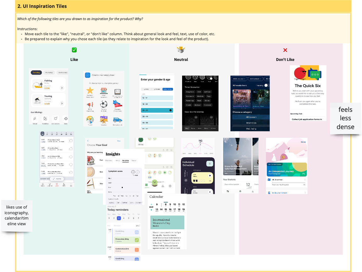
Because ParentApp had no MVP, having the team categorize these UI tiles into groups gave me a lot of direction in how they wanted their product to look.
Making moodboards in this way was a first for me. Previously, a moodboard to me was gathering images of already existing products or designs that I could take inspiration from. At Fuzzy Math, I created buttons and components to show the client how the product may potentially look like.
This direction was to consider the professional and clinical look that some of the team members had a preference for. I wanted to show straightforwardness without coming off as a sterile.
As someone who isn’t coming from a formal design background, I learned so much in this phase!
Learning from other designers about the technicalities of font pairings, spacing, and color theory was a lot of fun.
One of my favorite things about this project was reaching out to other VIsual Designers at Fuzzy Math and learning from them about their design and presentation process.